Hello! We are Collab, an Innovation Lab & Fabrication Studio that brings ambitious ideas to life
Featured Projects
What We Do
Services
Experiential Design
- Discovery & Ideation
- Storyboarding
- Prototyping
- Usability Testing
- Implementation
Fabrication
- CNC Machining
- 3D Printing
- Welding
- Laser Cutting
- Printing
- Technology Integration
Logistics & Operations
- Staffing
- Installation
- Project Management
Our Clients
"In my many years of experience working with creative design and logistics firms, I’d be hard pressed to find a group more clear and concise in their communication – not to mention their attention to detail in every phase of a project. Beyond their vast technical expertise, creative problem solving skills, and collaborative problem solving ethos - they are without a question the nicest group of people I’ve had the pleasure of working with."
"So much of the exhibit's positive reviews and success comes from the first-class experience that you and your team created. It has been a great pleasure to work with you on this project and I look forward to working with you again in the future on other projects."
"Thanks for your incredible commitment to the project and the incredibly positive energy that you brought to bear. I must say that the last few months, the warmth and respect that I felt for all you guys, and your professionalism, selflessness and support is unrivaled."
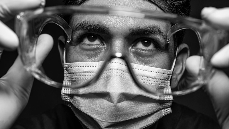
"We are forever indebted to Collab for stepping up at a critical time for NYC. What you pulled off in short order was nothing short of a miracle. There were many days when, if not for these kits, local hospitals would have been entirely without testing supplies."


